3カラムの記事一覧を作成する方法
公開日 : 最終更新日 :
- コーディング

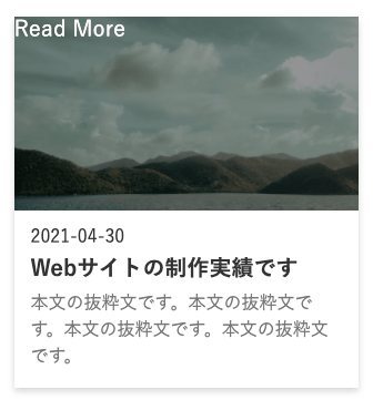
この記事では、サイトでよく見かける下記のようなカード型の記事一覧を作成する方法をご紹介します。
あくまで一例として、参考にしてみてください。

今回はカードのエリアにホバーすると、サムネイル部分に黒いマスクと「Read More」がフワッと出現するようにしてみます。

目次
全体のHTML
<section class="ly_section">
  <div class="ly_section_inner">
    <h2 class="el_lv2Heading">3カラムの記事一覧</h2>
    <!-- ここから3カラム記事エリア -->
    <ul class="card_items">
      <li>
        <a class="card_item" href="#">
          <article>
            <figure class="card_item_imgWrapper">
              <img src="assets/img/photo.jpg" alt="">
            </figure>
            <div class="card_item_body">
              <time datetime="2021-04-30" class="card_item_time">
                2021-04-30
              </time>
              <h3 class="card_item_ttl">
                Webサイトの制作実績です
              </h3>
              <p class="card_item_txt">
                本文の抜粋文です。本文の抜粋文です。本文の抜粋文です。本文の抜粋文です。
              </p>
            </div>
          </article>
        </a>
      </li>
      <!-- 以下省略 -->
    </ul>
    <!-- 3カラム記事エリアここまで -->
  </div>
</section>
次にカード単体のHTMLを見てみましょう。
<li>
  <a class="card_item" href="#">
    <article>
      <figure class="card_item_imgWrapper">
        <img src="assets/img/photo.jpg" alt="">
      </figure>
      <div class="card_item_body">
        <time datetime="2021-04-30" class="card_item_time">
          2021-04-30
        </time>
        <h3 class="card_item_ttl">
          Webサイトの制作実績です
        </h3>
        <p class="card_item_txt">
          本文の抜粋文です。本文の抜粋文です。本文の抜粋文です。本文の抜粋文です。
        </p>
      </div>
    </article>
  </a>
</li>
ポイント
- クリックすると記事詳細ページに飛ばしたいので
liの直下はaで囲みます - 記事コンテンツなので
aの直下はarticleで囲みます article内は画像ブロック、テキストブロックの2つに分けてマークアップしています
全体のCSS
//コンテンツ幅やセクション見出しのスタイリング
.ly_section {
  padding: 100px 0;
}

.ly_section_inner {
  max-width: 1030px;
  padding: 0 15px;
  margin: 0 auto;
}

.el_lv2Heading {
  font-size: 3rem;
  text-align: center;
  margin-bottom: 70px;
}

//ここから3カラム記事エリアのスタイリング
.card_items {
  display: -webkit-box;
  display: -ms-flexbox;
  display: flex;
  -ms-flex-wrap: wrap;
  flex-wrap: wrap;
}

.card_items > li {
  width: 31%;
  margin-right: 3.5%;
  margin-bottom: 35px;
}

.card_items > li:nth-of-type(3n) {
  margin-right: 0;
}

.card_item {
  position: relative;
  display: block;
  -webkit-box-shadow: 0 3px 6px rgba(0, 0, 0, 0.16);
  box-shadow: 0 3px 6px rgba(0, 0, 0, 0.16);
}

//画像エリアのスタイリング
.card_item:hover .card_item_imgWrapper::before {
  opacity: 1;
}

.card_item:hover .card_item_imgWrapper::after {
  content: "Read More";
  display: -webkit-box;
  display: -ms-flexbox;
  display: flex;
  -webkit-box-pack: center;
  -ms-flex-pack: center;
  justify-content: center;
  -webkit-box-align: center;
  -ms-flex-align: center;
  align-items: center;
  opacity: 1;
}

.card_item_imgWrapper {
  position: relative;
  padding-top: 56.25%;
  overflow: hidden;
}

.card_item_imgWrapper::before, .card_item_imgWrapper::after {
  content: "";
  display: block;
  position: absolute;
  top: 0;
  left: 0;
  width: 100%;
  height: 100%;
  color: #fafafa;
  background-color: rgba(0, 0, 0, 0.4);
  font-size: 2rem;
  -webkit-transition: opacity .5s;
  transition: opacity .5s;
  opacity: 0;
}

.card_item_imgWrapper > img {
  position: absolute;
  top: 50%;
  width: 100%;
  height: 100%;
  -webkit-transform: translateY(-50%);
  transform: translateY(-50%);
  -o-object-fit: cover;
  object-fit: cover;
}

//日時、タイトル、抜粋文テキスト部分のスタイリング
.card_item_body {
  height: 160px;
  padding: 15px;
}

.card_item_body > .card_item_time {
  font-size: 1.6rem;
  margin-bottom: 5px;
  display: block;
}

.card_item_body > .card_item_ttl {
  color: #333;
  font-size: 2rem;
  font-weight: bold;
  line-height: 1.5;
  margin-bottom: 5px;
  overflow-x: hidden;
  white-space: nowrap;
  text-overflow: ellipsis;
}

.card_item_body > .card_item_txt {
  color: #777;
  font-size: 1.6rem;
  line-height: 1.5;
  margin-bottom: 10px;
}
では各CSSを細かく見ていきましょう。
まずはul liの部分。
//ここから記事一覧のスタイリング
.card_items {
  display: -webkit-box;
  display: -ms-flexbox;
  display: flex;
  -ms-flex-wrap: wrap;
  flex-wrap: wrap;
}

.card_items > li {
  width: 31%;
  margin-right: 3.5%;
  margin-bottom: 35px;
}

.card_items > li:nth-of-type(3n) {
  margin-right: 0;
}
ポイント
- 記事一覧を横並び+折り返したいので、
ul(card_item)にdisplay: flex;とflex-wrap: wrap;を指定 liにはレイアウトに関する指定をします
widthを固定値(px)ではなく%にすることで、タブレットサイズのような画面幅にも収まるようになります。
下記はiPadサイズ(768px × 1024px)で表示させた時↓

隣り合うカード間、左右余白のmargin-rightも同様に%指定します。

少し深掘りすると、記事一覧の横幅100%を記事3つ分(今回は31%×3=93%)に分けて、余った7%を余白の数で割ります(7%÷2=3.5%)。
割って求めた値をmargin-rightに当てています。
ただこれだけだと、3番目のli要素にも適用されてしまいますので、「li:nth-of-type(3n)」で3の倍数に位置するli要素にはmargin-right: 0;を上書きしています。
カードの幅や余白を何%にするかは、デザインカンプのコンテンツ幅により適宜調整してみてください。
画像部分のスタイリング
.card_item {
  display: block;
  -webkit-box-shadow: 0 3px 6px rgba(0, 0, 0, 0.16);
  box-shadow: 0 3px 6px rgba(0, 0, 0, 0.16);
}

//画像エリアのスタイリング
.card_item:hover .card_item_imgWrapper::before {
  opacity: 1;
}

.card_item:hover .card_item_imgWrapper::after {
  content: "Read More";
  display: -webkit-box;
  display: -ms-flexbox;
  display: flex;
  -webkit-box-pack: center;
  -ms-flex-pack: center;
  justify-content: center;
  -webkit-box-align: center;
  -ms-flex-align: center;
  align-items: center;
  opacity: 1;
}

.card_item_imgWrapper {
  position: relative;
  padding-top: 56.25%;
  overflow: hidden;
}

.card_item_imgWrapper::before, .card_item_imgWrapper::after {
  content: "";
  display: block;
  position: absolute;
  top: 0;
  left: 0;
  width: 100%;
  height: 100%;
  color: #fafafa;
  background-color: rgba(0, 0, 0, 0.4);
  font-size: 2rem;
  -webkit-transition: opacity .5s;
  transition: opacity .5s;
  opacity: 0;
}

.card_item_imgWrapper > img {
  position: absolute;
  top: 50%;
  width: 100%;
  height: 100%;
  -webkit-transform: translateY(-50%);
  transform: translateY(-50%);
  -o-object-fit: cover;
  object-fit: cover;
}
ポイント
figureの擬似要素で黒背景(before)と、「Read More」テキスト(after)を実装しています。
擬似要素内のテキストは、ただcontentに入れただけだと左上に配置されてしまいます↓
ですので、Flexboxを同時に指定することで上下左右中央にもってきます。
指定するFlexプロパティ↓
- display: flex;
- justify-content: center;
- align-items: center;
.card_item:hover .card_item_imgWrapper::after {
  content: "Read More";
  display: -webkit-box;
  display: -ms-flexbox;
  display: flex;
  -webkit-box-pack: center;
  -ms-flex-pack: center;
  justify-content: center;
  -webkit-box-align: center;
  -ms-flex-align: center;
  align-items: center;
  opacity: 1;
}
設定後↓
figure(card_item_imgWrapper)に対する指定
.card_item_imgWrapper {
  position: relative;
  padding-top: 56.25%;
  overflow: hidden;
}
- relativeは後に解説する
imgの方で、absoluteを使用するための起点として指定しています - padding-top: 56.25%は、画像領域の高さを確保するために記述です
下層のimgにabsoluteを使用する関係上、heightでは高さを上手く確保できないため、padding-topを使用しています。
ちなみに56.25%は縦横比16:9のサイズになります。
計算式としては、
高さ比率÷幅比率×100
今回の例だと、9÷16×100=56.25%ですね。
他にも
2:1なら50%
1:2なら200%
4:3なら75%
という風になります。
imgに対する指定
.card_item_imgWrapper > img {
  position: absolute;
  top: 50%;
  width: 100%;
  height: 100%;
  -webkit-transform: translateY(-50%);
  transform: translateY(-50%);
  -o-object-fit: cover;
  object-fit: cover;
}
ここでは画像の上下位置を調整しつつ、width: 100%;で横幅いっぱいに表示されるよう指定しています。
はみ出る分は、card_item_imgWrapperのoverflow: hidden;でトリミングします。
height: 100%;とobject-fit: cover;について
上記2つのプロパティを使わないと、想定サイズからかけ離れた画像は下記のようになってしまいます↓

そこでそれらのプロパティを指定することで、スペースいっぱいに広がってくれるようになります。
設定後↓

これでposition: absolute;と合わせ、今後想定しない画像が使用されても上下左右中央揃えでトリミングされるようになります。
object-fitはIE未対応
object-fitは便利なプロパティですが、残念ながらIEには未対応…。
IE対応を視野に入れるのであれば、プラグインがありますのでそちらを導入しましょう。
日時、タイトル、抜粋文テキスト部分のスタイリング
//日時、タイトル、抜粋文テキスト部分のスタイリング
.card_item_body {
  height: 160px;
  padding: 15px;
}

.card_item_body > .card_item_time {
  font-size: 1.6rem;
  margin-bottom: 5px;
  display: block;
}

.card_item_body > .card_item_ttl {
  color: #333;
  font-size: 2rem;
  font-weight: bold;
  line-height: 1.5;
  margin-bottom: 5px;
  overflow-x: hidden;
  white-space: nowrap;
  text-overflow: ellipsis;
}

.card_item_body > .card_item_txt {
  color: #777;
  font-size: 1.6rem;
  line-height: 1.5;
  margin-bottom: 10px;
}
height: 160px;について
これは抜粋文の量に左右されずに一定の高さを維持するための対策です。
仮に指定しないと下記のような状態になり、見栄えが悪くなってしまいます。

設定後↓

日時
.card_item_body > .card_item_time {
  font-size: 1.6rem;
  margin-bottom: 5px;
  display: block;
}
timeはインライン要素なので、display: block;でmarginが効くようにします。
タイトル
.card_item_body > .card_item_ttl {
  color: #333;
  font-size: 2rem;
  font-weight: bold;
  line-height: 1.5;
  margin-bottom: 5px;
  overflow-x: hidden;
  white-space: nowrap;
  text-overflow: ellipsis;
}
overflow-x: hidden;、white-space: nowrap;、text-overflow: ellipsis;について
タイトルはどんなに長くても一行で収まるようにしていますので、上記3つのプロパティを指定しています。
text-overflow: ellipsis;を加えることで、文末に3点リーダーが付与されます。
2行以上にしたい場合、3つのプロパティは不要です。
抜粋文
.card_item_body > .card_item_txt {
  color: #777;
  font-size: 1.6rem;
  line-height: 1.5;
  margin-bottom: 10px;
}
抜粋文に関してはこれと言った特殊な指定はしていません。
WordPress化前提でコーディングすると思いますので、表示させるテキスト量は「wp_trim_words」で操作しましょう。
以上、3カラムの記事一覧について解説しました。