Unlock the Power of Hybrid Scrolling with JavaScript
release date :
- Coding
Hey there, it’s M from the Engineer Team!
In recent years, a fascinating trend has emerged in web design.
As you navigate down a webpage, it unexpectedly shifts from traditional vertical scrolling to horizontal scrolling before seamlessly returning to its vertical flow.
We’ve seen this innovative technique referred to as “hybrid scrolling.”
Today, we’re excited to share with you a method that accomplishes this effect with minimal CSS and vanilla JavaScript.
Table of Contents
Essential Components
First, let’s look at the code and explain each part to better understand how we achieved the effect.
See the Pen hybrid scrolling by bibomato (@bibomato) on CodePen.
HTML
At first glance, there doesn’t seem to be anything particularly special happening.
Here’s a simplified representation of the HTML structure, with ellipses indicating the horizontally scrolling elements:
<section>
  <div>
    <h1></h1>
    <p></p>
  </div>
</section>

<div class="scroll_container">
  <div class="sticky_wrap">
    <div class="horizontal_scroll">
      ...
      ...
    </div>
  </div>
</div>

<section>
  <div>
    <h1></h1>
    <p></p>
  </div>
</section>
CSS
To make the hybrid scrolling effect work seamlessly, we need a few key components:
position: stickyis crucial to keep the content in view while scrolling. It essentially detaches the content from the HTML flow but retains it within its parent<div>.- The container and the scrolling
<div>must share identical height and width values. This affects the JavaScript calculations. Each additional “page” added horizontally should increment the width by 100 units. For instance, 6 “pages” would require a width of 600vh/vw.
.scroll_container {
  height: 400vh;
}

.sticky_wrap {
  overflow: hidden;
  position: sticky;
  top: 0;
  height: 100vh;
}

.horizontal_scroll {
  position: absolute;
  top: 0;
  height: 100%;
  width: 400vw;
  will-change: transform;
  display: flex;
  justify-content: space-between;
  align-items: center;
}
For an more on position: sticky, please refer to our blog post that gives an in-depth look at the CSS property here:
https://and-ha.com/coding/how-to-position-sticky/
JavaScript
Now, let’s dig into the code that makes it all happen:
We begin by declaring the container.
const stickySections = [...document.querySelectorAll('.sticky_wrap')]A spread operator is used to turn all containers into an array, making it convenient for reusing the hybrid scrolling effect.
Next, we iterate through each section using a for loop, tracking scroll progress.
const stickySections = [...document.querySelectorAll('.sticky_wrap')]

window.addEventListener('scroll', (e) => {
  for(let i = 0; i < stickySections.length; i++){
    transform(stickySections[i])
  }
})
Then we will make a function responsible for the heavy lifting.
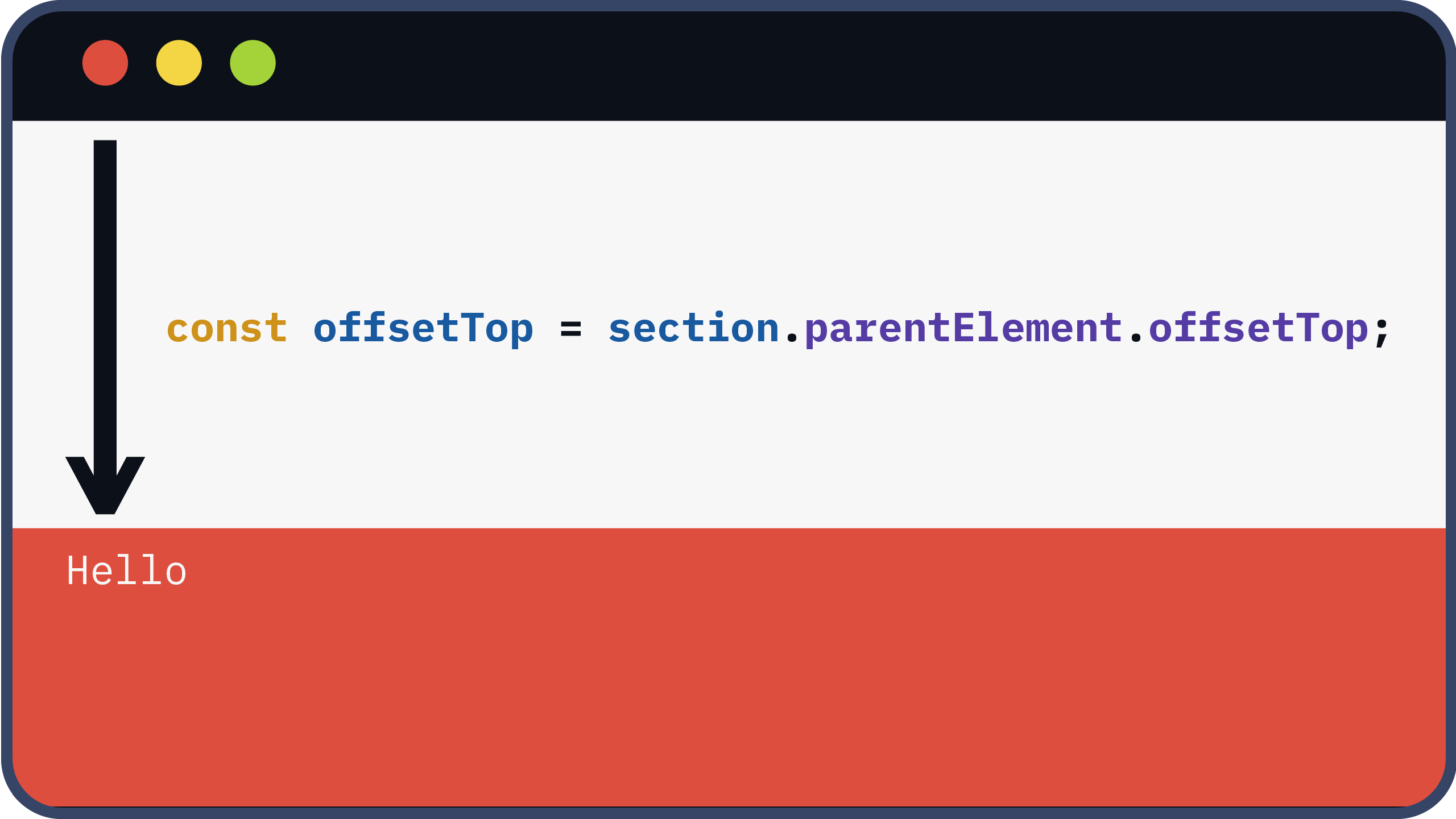
To initiate horizontal scrolling at the right moment, we calculate the offset from the top of the viewport to the container.
const stickySections = [...document.querySelectorAll('.sticky_wrap')]

window.addEventListener('scroll', (e) => {
  for(let i = 0; i < stickySections.length; i++){
    transform(stickySections[i])
  }
})

function transform(section) {

  const offsetTop = section.parentElement.offsetTop;

}
Then, we declare each section within the container.
const stickySections = [...document.querySelectorAll('.sticky_wrap')]

window.addEventListener('scroll', (e) => {
  for(let i = 0; i < stickySections.length; i++){
    transform(stickySections[i])
  }
})

function transform(section) {

  const offsetTop = section.parentElement.offsetTop;

  const scrollSection = section.querySelector('.scroll_section')

}
Using the offset between the viewport and the container, we convert the pixel amount to a VW value.
const stickySections = [...document.querySelectorAll('.sticky_wrap')]

window.addEventListener('scroll', (e) => {
  for(let i = 0; i < stickySections.length; i++){
    transform(stickySections[i])
  }
})

function transform(section) {

  const offsetTop = section.parentElement.offsetTop;

  const scrollSection = section.querySelector('.scroll_section')

  let percentage = ((window.scrollY - offsetTop) / window.innerHeight) * 100;

}
Finally, with the calculated value, we transform VH to VW by setting it as the ‘x’ value.
const stickySections = [...document.querySelectorAll('.sticky_wrap')]

window.addEventListener('scroll', (e) => {
  for(let i = 0; i < stickySections.length; i++){
    transform(stickySections[i])
  }
})

function transform(section) {

  const offsetTop = section.parentElement.offsetTop;

  const scrollSection = section.querySelector('.scroll_section')

  let percentage = ((window.scrollY - offsetTop) / window.innerHeight) * 100;

  scrollSection.style.transform = `translate3d(${-(percentage)}vw, 0, 0)`
}
While translate(${-(percentage)}vw, 0) is an option, using translate3d harnesses your device’s GPU for enhanced performance.
To ensure that horizontal scrolling commences only within specific offsets, we set the following conditions:
- If the offset is less than 0 or equal to 0, no action is taken.
- Similarly, if the offset exceeds a certain threshold (e.g., 300 based on the container’s VH), it remains unchanged.
- This unit will be 100 less than the container’s VH.
const stickySections = [...document.querySelectorAll('.sticky_wrap')]

window.addEventListener('scroll', (e) => {
  for(let i = 0; i < stickySections.length; i++){
    transform(stickySections[i])
  }
})

function transform(section) {

  const offsetTop = section.parentElement.offsetTop;

  const scrollSection = section.querySelector('.scroll_section')

  let percentage = ((window.scrollY - offsetTop) / window.innerHeight) * 100;

  percentage = percentage < 0 ? 0 : percentage > 300 ? 300 : percentage;

  scrollSection.style.transform = `translate3d(${-(percentage)}vw, 0, 0)`
}
More examples
We’ve included an example employing the same code, this time with images.
See the Pen hybrid scrolling by bibomato (@bibomato) on CodePen.
The percentage threshold adjusts as you increase the number of items within the container.
Additionally, we’ve listed some websites that employ hybrid scrolling.
Please note that they may employ different techniques to alter the scroll direction.
Conclusion
In just about 10 lines of JavaScript, you can implement this captivating effect, adding an extra layer of sophistication to your projects.
Feel free to use this as a foundation, tailoring it to suit your website’s unique requirements.
Thank you for joining us on this journey, and as always, stay tuned for more exciting insights!
-M