Mind the Gap: List Item Margin and Paddings
release date :
- Coding
Hey, it’s M from the coding team.
I’m just going to say what we’re all thinking, lists can be frustrating.
If you’re like me, every time you make a list you go through the motions.
- ”How do I move the text and not the marker?”
- ”Why is the the text only moving?”
- ”Why won’t someone make an easy to understand guide about the differences between margin and padding for lists?”
Well, I have good news because that’s exactly what this article is about.
Table of Contents
<ul/ol>Unordered/Ordered List
The <ul> and <ol> is the paper where the list is written on.
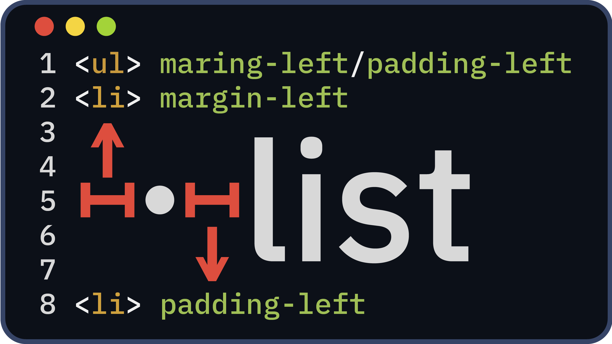
When you apply margin and padding to a <ul>, you get two different results.
See the Pen <ul> margin/padding by bibomato (@bibomato) on CodePen.
By default, the marker for a list is displayed before the list.
Adding margin will shifts the entire list to the left.
However, padding will shift the contents, including the marker.
<li> Margin and Padding
The list item is housed within an ordered/unordered list.
See the Pen <li> margin/padding by bibomato (@bibomato) on CodePen.
Changing the margin of an <li> will have a similar effect to adding padding to a <ul>.
However, <li> tags that have added padding will physically change the space between the text and the marker.

list-style-position
There is also a CSS property that changes whether the marker is inside or outside the ordered/unordered list called list-style-position.list-style-position text will also behave differently.
See the Pen <li> list-style-position by bibomato (@bibomato) on CodePen.
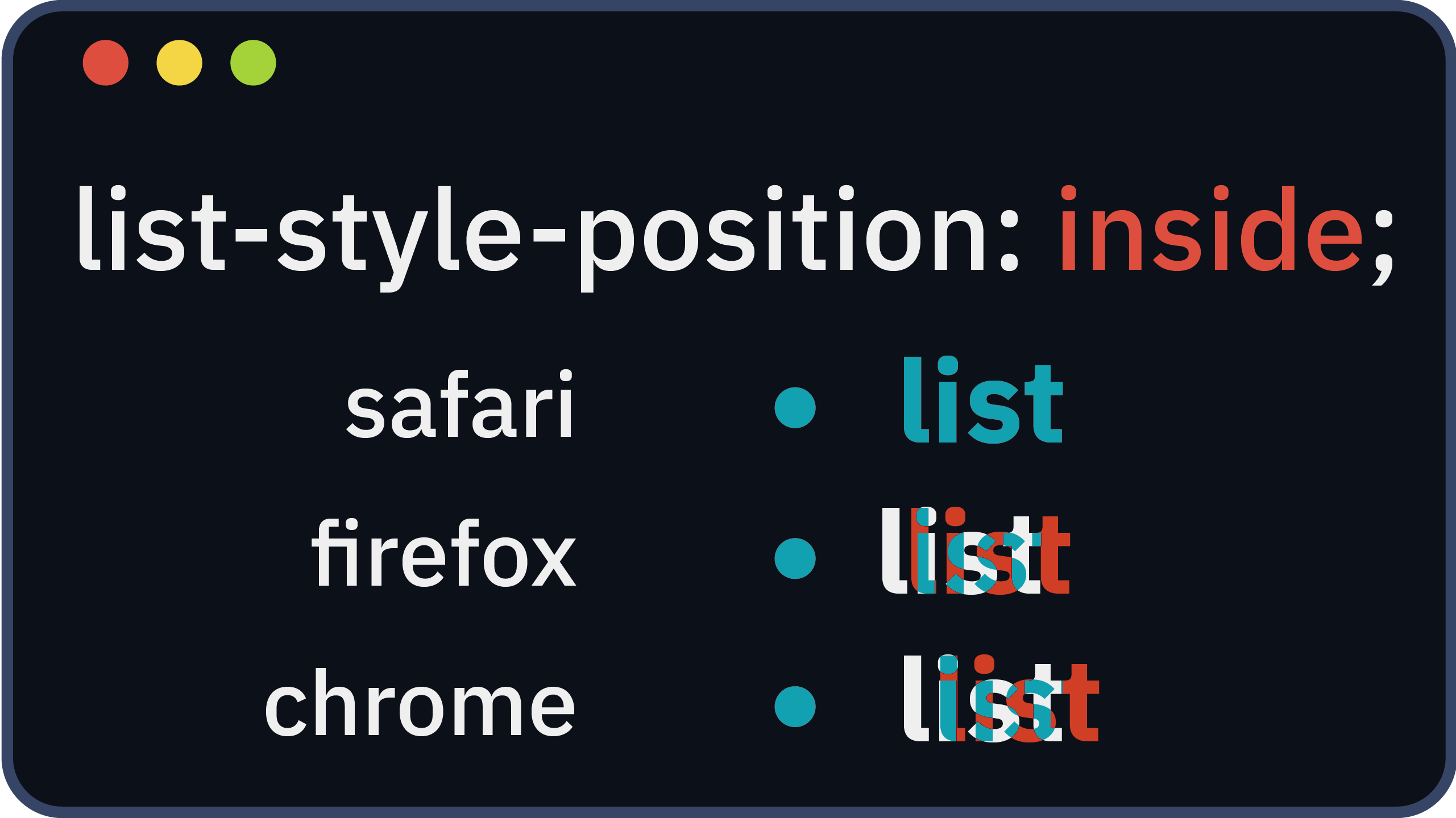
If list-style-position:inside is present, the text will behave differently compared to a margin change.
A new line will start below the marker rather than after.
Browser Differences
It is important to note that each browser has a different width between the marker and the text.
For instance, Chrome has a bug that makes the width between the marker and text three times larger.

Conclusion
Lists in frontend development are crucial items for developers and the user experience.
We hope this gives you a deeper understanding of each properties behavior and can be adapted into your designs.
Until next time,
M.